Share This
How does whole grain consumption in your country stack up against other countries around the world? A new resource from Tufts University – the Global Dietary Database – can tell you.
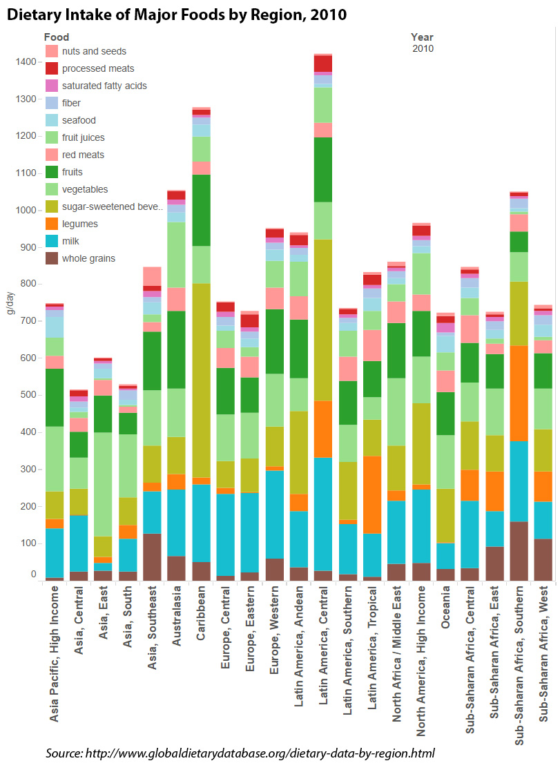
You can start by looking at the big picture of major food groups, region by region, as shown in the bar graph at the right. Those little brown blocks at the base of the graph are the whole grains. You’ll see that grams of whole grain typically consumed per day ranged from a low of 9.7 grams per day in “Asia Pacific, High Income” (Japan, S. Korea, Singapore, Brunei) to 159.7 grams per day in “Sub-Saharan Africa, South” (Botswana, Lesotho, Namibia, Swaziland, South Africa, Zimbabwe). Somewhere in the middle is “North America, High Income” (US and Canada) at 49 grams per day.
It’s pretty apparent from the graph that countries where poverty has preserved many of the old ways of eating top the charts in whole grain consumption, while some richer countries – and many developing nations – have moved away from the whole grains that were once typical of their traditional diets. A lot has changed in recent years, though; do keep in mind that these data are from 2010.
Want more details? Click on the graphic to go to the original, which is a bit clearer and allows you to hover and get amounts for any food group in any region.
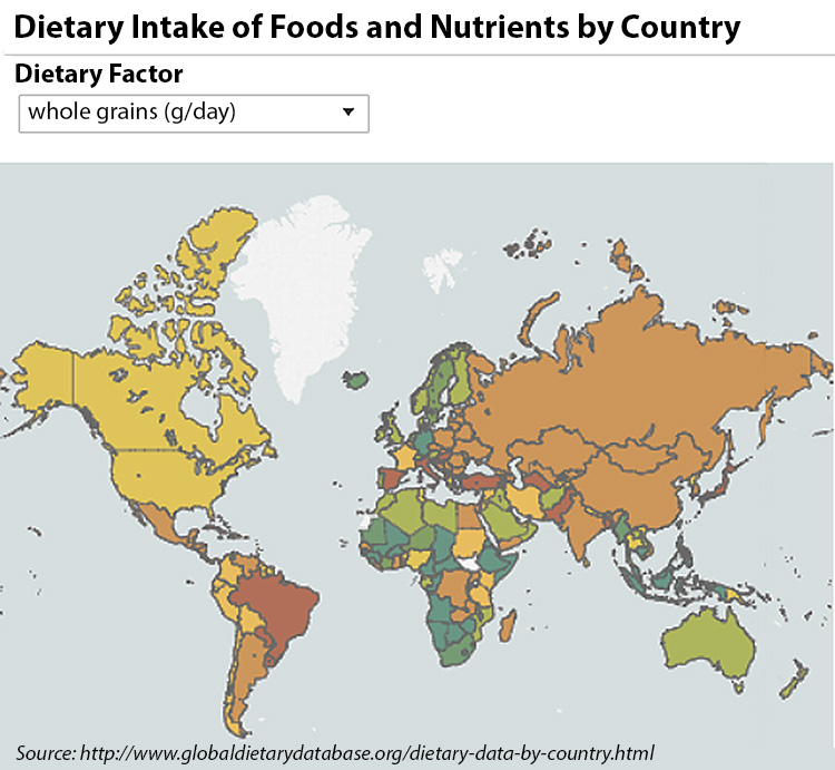
You can also check out a map that compares consumption of nineteen different nutrients and food groups – from calcium and cholesterol to vegetables and whole grains – for nearly every country in the world. We have, of course, chosen to see whole grains, from among these many choices. On the maps, darker red/brown is “bad” (e.g. low in whole grains, compared to the global mean) and green is “good” (e.g. high in whole grains compared to the global mean). Yellow/gold is at or close to the global mean. (Again, keep in mind that these data are from 2010.)
This map makes the regional patterns for whole grains even more readily apparent: Much of Africa, Scandinavia, Southeast Asia and Australia are doing best on whole grain consumption, while Latin America and much of Asia are lagging. The original map is also interactive; click on our graphic to go to the Global Dietary Database site and take a look at other factors besides whole grains. Fascinating, for those of us who are data geeks.
The database was created by the Global Nutrition and Policy Consortium at the Tufts Friedman School of Nutrition Science and Policy to fill a gaping hole in our understanding of global food patterns. Funded in large part by the Bill & Melinda Gates Foundation, the Consortium has built a network of more than 200 corresponding members in countries around the world. These corresponding members keep track of local data that might go unnoticed otherwise, and feed it into a central repository. Consortium staff vet the data, and use it to update the resources on their website.
The Tufts group has also published a few papers that discuss the backstory of the Global Dietary Database project and provide additional indepth data to complement the graphs and charts on their website. Here’s a link to one such paper (open access) for those interested:
We’re looking forward to following this website in the coming years, to track whole grain momentum around the world. (Cynthia)


Comments
Add a Comment